Form is a myth. We checked 19,162 matches.
And head-to-head. And rest days. This is how Sirius — the engine that writes the verdict on every Oddsivio match page — decides what counts, shows its receipts, and gets graded in public.
Every football fan carries a mental model of what decides a match. The pundit version is familiar: form is temporary, class is permanent — right before the same pundit backs the in-form side anyway. Head-to-head records get read out like prophecies. A team on a long week is "fresher" than one that played Thursday.
When we built Sirius, we made one rule and refused to break it: nothing influences a verdict unless history proves it predicts. So we took 19,162 finished matches across 52 competitions from the last two seasons and measured the football wisdom everyone repeats.
Most of it failed.
The myths, measured
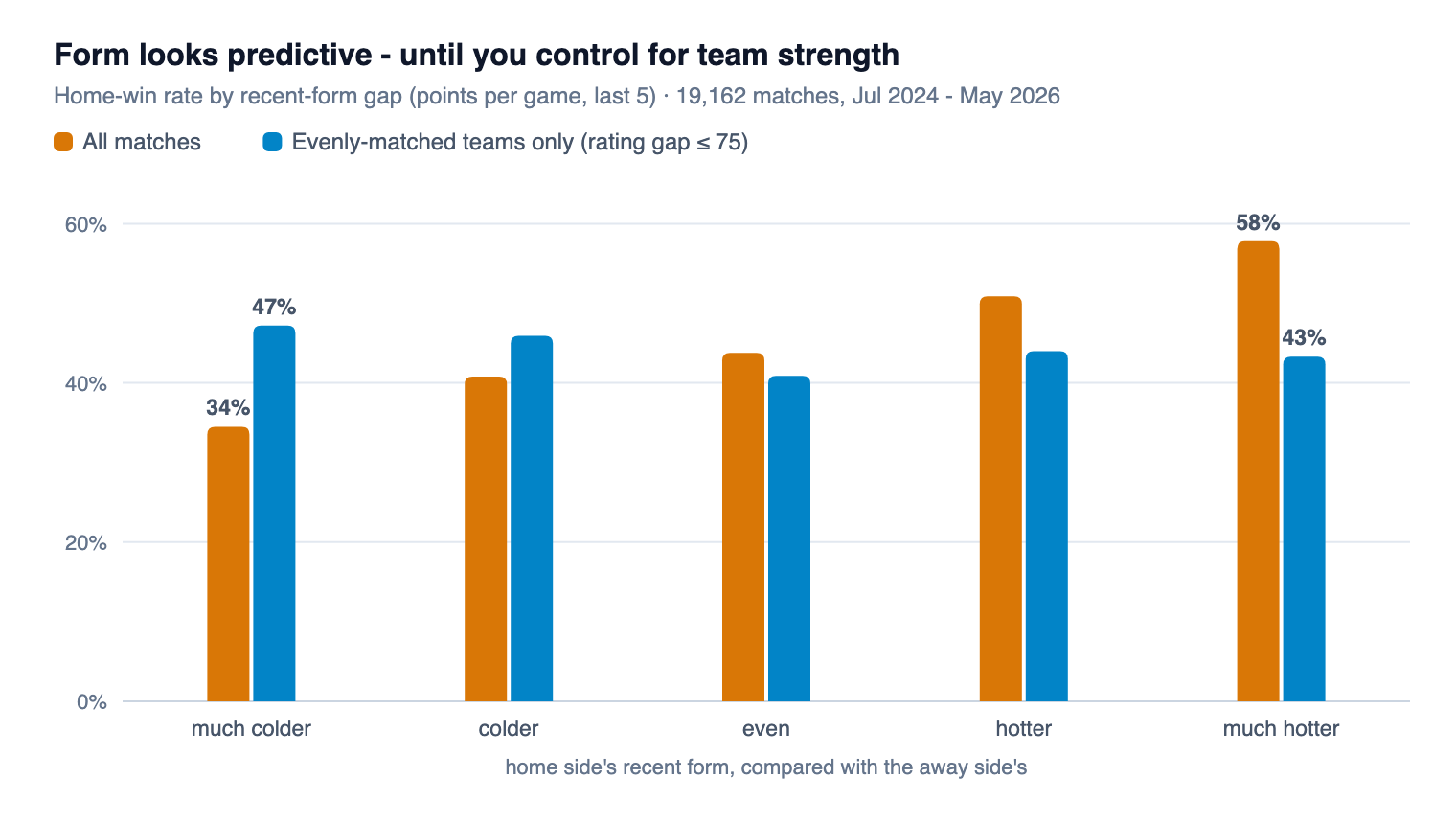
Start with form. If you look naively, form is spectacular: home sides much hotter than their opponent over the last five games won 58% of matches; much colder ones won 34%. Case closed?
Not quite. Good teams are usually in form — because they are good. Form mostly repeats the class story in a louder voice. The honest test is to compare teams of similar strength, and there the slope vanishes:
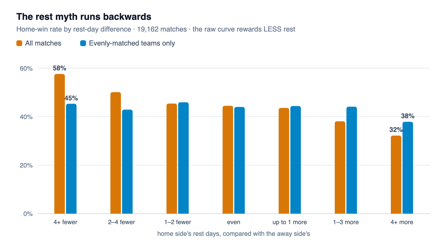
Rest days are stranger: the raw curve runs backwards. Home sides with four or more days less rest than their opponent won 58% of games; the well-rested won 32%. Fatigue bonus? No — the under-rested teams are the good teams, squeezing league games between European nights. Control for strength and the whole thing flattens out:
Head-to-head goes the same way, no chart needed. Raw: when one side had won most of the recent meetings, they won the next one 51% of the time versus 37%. Between evenly-matched teams: 40% versus 44% — the "pattern" is gone, and the sample gets so thin we wouldn't trust it anyway.
Form, head-to-head and rest aren't signals. They're class wearing a costume.
You'll still see them on a Sirius card — as context lines, pinned at zero points, each carrying the receipt for why it scores nothing. Logged, not ignored.
The receipt rule
That measuring exercise became Sirius's constitution. A receipt is a sentence of the form: "sides with this profile won X% of N such games, where teams of that strength were expected to win Y%." The comparison against expectation is what kills the costume problem — a factor only earns points for what it adds beyond class.
And the bar is fixed: at least 300 games in the cell, and a result that clears the noise band. Fail either test and the factor scores zero — visibly, on the card, with its receipt attached. Factors don't have opinions. History does.
The one curve that survived
What's left when the myths are stripped away? Mostly one thing: how strong the two teams actually are. We keep a strength rating for every club, built from every result in the database, and the curve it draws is beautifully boring:
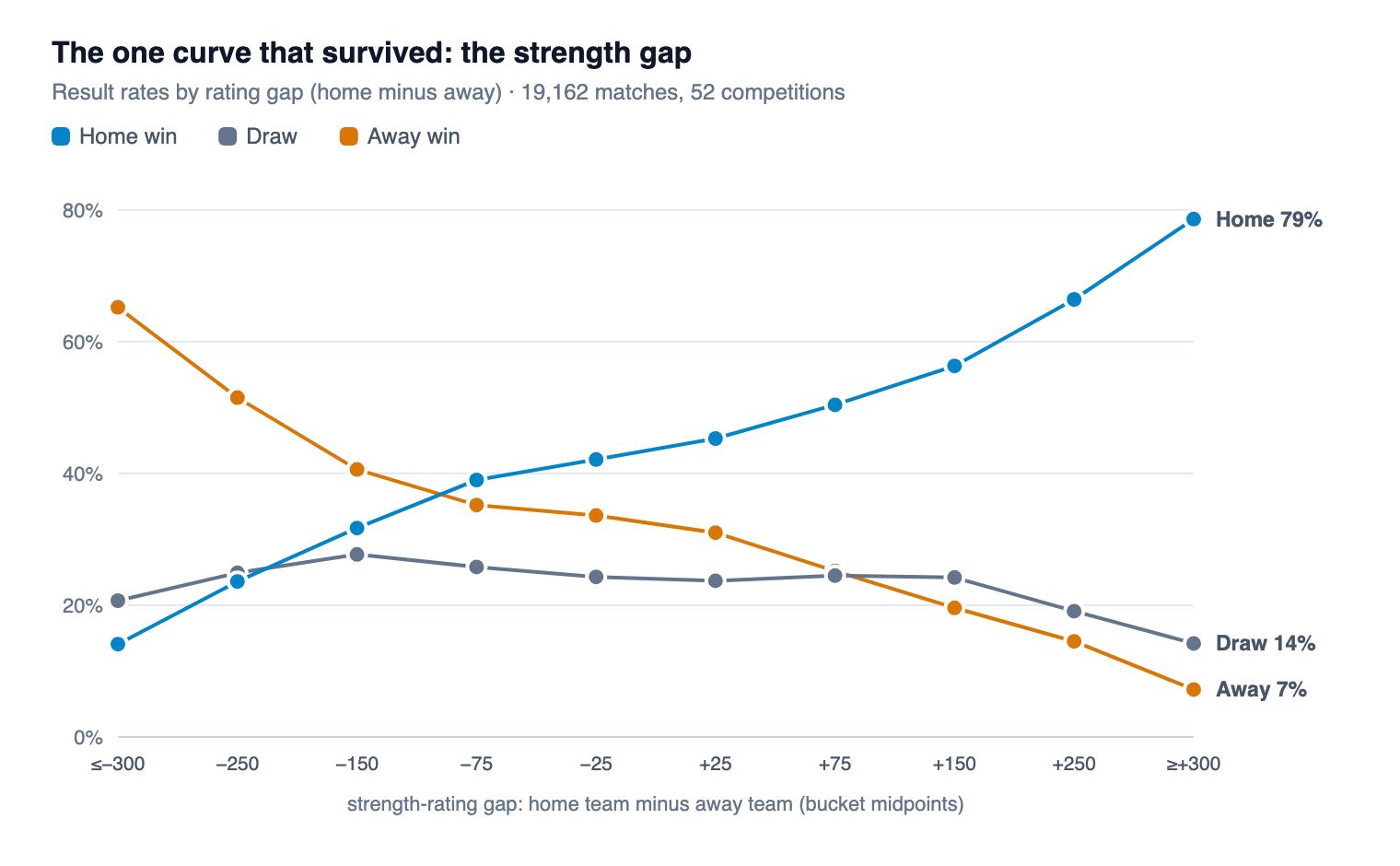
Season points-per-game and expected-goals differences all confirm the same ranking — so they appear on cards as corroboration, extra receipts with no extra points. One honest wrinkle: at the extremes the table runs coarse, so past a 250-point gap Sirius also consults the 300 most similar historical matches. You can see exactly that happening in the game below.
Watch it work: Nashville SC 1–0 Atlanta United
Here is a real verdict, exactly as Sirius froze it before kickoff on July 18 — first place hosting 28th in Major League Soccer:
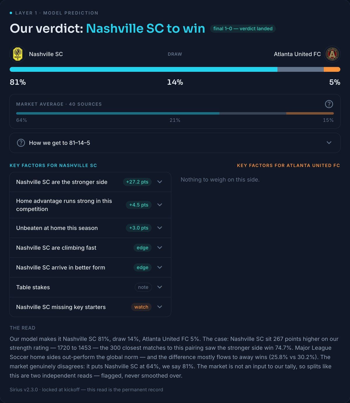
The tally isn't a black box; it's an addition you can follow:
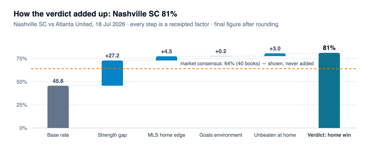
Tap any factor and its receipt unfolds. The big one here: "sides with a 200–300-point rating edge at home won 67.1% of 5,866 such games" — and because this gap sits past the coarse zone, "the 300 most similar games went 75–14–11." The MLS home-advantage line: "49.5% of 5,022 games versus the 44.9% norm." Nashville's unbeaten home season: "59.1% of 4,853 such games where 56.1% was expected" — one of the few streak facts that clears the bar.
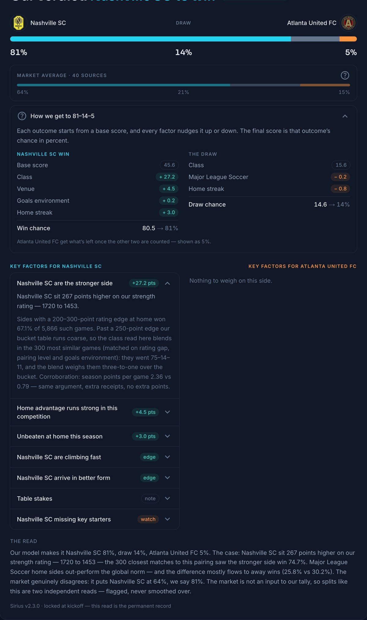
The zeros are the point. Nashville arrived hotter on form — zero points, with the receipt you saw above. They were climbing fast on our rating — measured, currently inside the noise band, zero. Missing three regular starters, about 36% of their usual starting XI? The honest answer is that our injury history is only two seasons deep — 207 comparable games, too thin — so it's flagged as a watch item at zero rather than invented as a number. Even "Table stakes" — what the game means for each side's season — scores zero here: the motivation effect is real but only shows in the last eight rounds of a season (motivated sides won 47.3% of 2,161 run-in games where 39.8% was expected), and this was round 17 of 30.
An engine that can say "this factor exists, but it doesn't count yet" is the one you can believe when it says a factor does count.
Nashville won 1–0. The tracker graded the verdict landed. And one match proves nothing — which is exactly why the next two sections exist.
A short one: where draws live
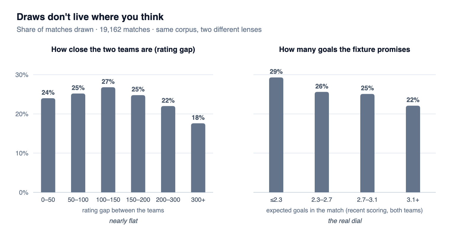
The draw is where most fans' intuition — and most simple models — go wrong. "These teams are close, expect a draw" turns out to be nearly false: draw rates barely move with how close the teams are. What moves them is how many goals the fixture promises:
When Sirius says nothing
Some games don't deserve a number, and pretending otherwise is how models quietly become fiction. If either team has fewer than 25 rated games behind it, Sirius abstains — the card says, in as many words, no verdict beats a guess. If the data underneath a game is stale or thin, a data gate sits the game out and says why. If one side is a near-newcomer, the verdict ships with a named caveat. The tracker counts these too, under "sat out honestly."
The market never gets a vote — but it grades our homework
Every card shows the market average alongside our number. It is never an input. Not a nudge, not a prior, not a tiebreak — the tally you watched add up above contains no market information at all. When the two reads split, the card flags it and says so out loud, the way it did for Nashville: market 64%, Sirius 81%.
Why keep something on the page that we refuse to use? Because it's the best examiner we have — and because we'd rather tell you the exam results ourselves:
- In a two-season replay of 9,090 held-out games, on the ~200 with a full market consensus, the market's typical chance on the eventual result was 36.1% against our 35.2%. The market is still a touch sharper where it speaks. We publish that sentence on purpose.
- In those replays, when our verdict flipped the market's favourite outright, the market was right more often than we were. Splits are flagged as information, never worn as a badge.
- On the live ledger so far: 28 settled games had a market consensus alongside — our lean landed 15, the market's 14. A coin-toss-sized sample, and we'll keep counting in public either way.
So why show our number at all? Because the market can't tell you why — it outputs a number, not an explanation. Sirius's job is the case: the receipts, the zeros, the honest abstains. The market's job, on our pages, is to keep that case honest.
Frozen before kickoff. Graded after.
Every verdict is re-scored nightly as evidence changes — then frozen at kickoff. The frozen read is the permanent record: results get filled in afterwards, and the numbers are never touched. All of it, misses included, is public:
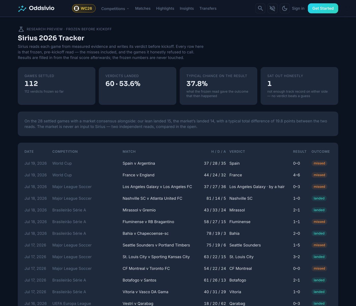
Is 53.6% good? Context: football has three outcomes, and always siding with the market favourite on the same slate landed 50%. The fairer score is that 37.8% — the chance our frozen read had assigned to whatever actually happened, across every game including the chaos. Judge us on the trend of that number, on the tracker, over a season. That's the deal.
See it on a game you care about. Open any match on Oddsivio — the verdict is on the match page, and every factor opens into its receipt. Then check the Sirius 2026 tracker, where we keep every call we've made, especially the wrong ones.
The fine print
For the readers who want the machinery. Everything above in plain words; everything below with its real names.
- The rating is an Elo-family strength score maintained per team over every competitive result in our database. The gap-to-outcome mapping is empirical, not the textbook logistic curve — the theoretical curve is overconfident at the tails (where it expects the stronger side to win 94% of the time, reality says 86%), so Sirius reads win rates off the measured bucket table instead.
- Neighbour blend: past a 250-point gap the bucket table runs coarse, so the class read blends the bucket with the 300 nearest historical matches (matched on rating gap, pairing level and goals environment), weighted 3-to-1 toward the neighbours. A two-season walk-forward chose that blend: buckets win in the dense mid-range, neighbours win at the edges.
- Receipts are computed as observed-versus-class-expected: each cell's result is compared against what the strength table alone would have predicted for those same games, which is what strips out the "good teams are also in form" confound. A cell needs n ≥ 300 and a 95% confidence interval clear of expectation to score points; home and away directions are always measured separately.
- Corpora: the study in this post is 19,162 finished matches (52 competitions, Jul 2024 – May 2026). The live system rebuilds every receipt nightly over its full, growing database — which is why a card today can cite cells like "44.9% across 98,207 games" and why live numbers will drift from this post's charts. That drift is the feature: receipts are recomputed evidence, not frozen marketing copy.
- Validation: walk-forward with receipts rebuilt as-of at each cutoff — burn-in through Jul 2025, then 9,090 out-of-sample games (Aug 2025 – May 2026). Log-loss ladder: always-base 1.072 → strength-only 1.024 → full ledger 1.021. The honest reading: class does most of the work; the receipted factors mostly size the chances rather than flip verdicts; and the market remains marginally sharper than the whole ledger where it has a full consensus.
- The draw dial starts from the class table's draw share and scales it by the fixture's expected-goals environment (clamped) — because that's the axis draws actually respond to, per the chart above.
- Serving & versioning: verdicts are written and re-scored nightly (06:45 UTC), frozen at kickoff, graded after. Every row is stamped with its scorer version (currently the ledger v2.3 line); when the scorer improves, new rows get the new version and frozen rows are never restated.
Questions, corrections, or a factor you think we should measure next: hello@oddsivio.com.