How to read an Oddsivio player page: values, percentiles and form, explained
Read player values, rolling 24-month profiles, squad importance and recent form on Oddsivio. A practical guide to the time windows, peer groups and missing data behind the numbers.
A player page brings identity, recorded performances, playing roles, value history and club context together. What appears depends on the data available. This guide walks through the page so you can understand what each number tells you — and which comparisons are worth making.
Guide updated: 22 September 2026. We use Lamine Yamal’s player page as our example. The retained screenshots were captured on 12 August 2026 and are labelled as historical illustrations; their figures are not today’s values. The explanations below describe the current product.
Start with the time window. The header’s Season selector changes season totals and season-based comparisons, but several panels have their own scope. Recent Form follows the latest ten official appearances; Rating history covers twelve calendar months; Player profile covers twenty-four. Current value, Value history, Preferred Positions and Squad importance do not become historical when you select an older season.
Step 1 — Find a player
Three ways in:
- Search — the magnifying glass in the top navigation finds any player by name.
- From a match — every name in a line-up on a match page links to that player's page.
- From the rankings — Player values lists every valued player, filterable by league, club and position. More on that page at the end.
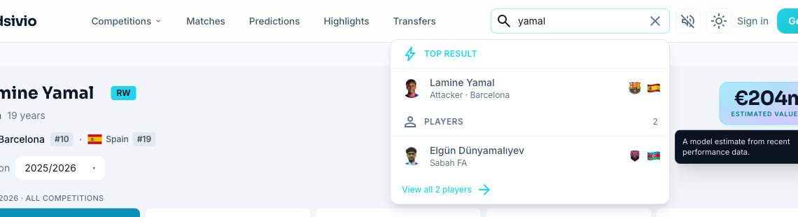
The header: who they are, what they're worth
The header puts the player’s name, club, country, age, recorded positions and estimated value together. The Season selector controls the season-based sections below; the identity and value remain current.
A few things worth decoding:
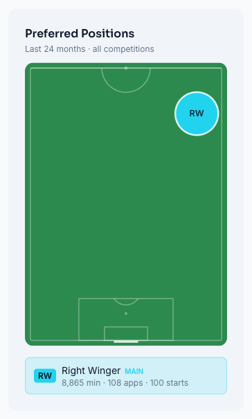
- Position chips summarise roles derived from recorded line-up formations over the last 730 days. They describe where the available line-up data places a player, not a personal preference or a tracking heatmap. The main role and its minutes help distinguish a winger who sometimes plays centrally from a regular centre-forward.
- Estimated value is a model estimate from recent performance data, not an asking price or an agreed transfer fee. A four-week change appears when enough history exists; click through to Value history to see the dated estimates behind it. Our value-model explainer describes the inputs and limitations.
- Transfer rumours can appear beside the value when an eligible story is available around a transfer window. Open the pill for the underlying story and sources. Its absence does not prove there is no transfer activity.
- For appearances, minutes, rating, goals and assists, move down to Season Overview in the Summary tab. Those season figures are separate from the current value and identity in the header.
The Summary tab: form and context at a glance
Below the header sit five tabs: Summary, Stats, Matches, Career, Transfers. Summary is what you land on.
Recent Form shows the last ten official appearances, regardless of the selected season. The result pills and match rows cover that set of games. Rating bars use a 4–10 scale, with a dotted line for the average of the rated appearances; an unrated match is not assigned a zero.
Match ratings come from our data provider. Read them alongside minutes and opponents: a brief substitute appearance is a different sample from ninety minutes. The Recent Form average describes the rated games in its ten-appearance window, not the whole selected season.
Season Overview has eight tiles: matches, minutes, average rating, goals, assists, key passes, shots on target and pass accuracy. Read the unit shown under each number. A per-90 rate is a total divided by minutes played, multiplied by 90; pass accuracy is a percentage, and a rating is a rating. Per-90 helps compare players with different playing time, but a small sample or different role can still mislead.
Preferred Positions turns recorded line-up roles from the last 730 days into a pitch diagram and minutes shares. It shows up to three roles that account for at least 10% each, once enough positional minutes are available. Treat it as a broad role summary: line-up positions do not capture every in-game movement. Career Snapshot previews the last two seasons; the Career tab holds the fuller record.
The player profile: a two-year comparison
Player profile appears in both Summary and Stats. It compares the last 24 calendar months across covered official competitions, including internationals, against players of all ages in the same broad position group. It requires at least 1,800 covered minutes and ten qualifying peers per statistic. The card states its dates, comparison group and last update.
The cyan shape is the player; the dashed amber shape is the position average. A percentile of 90 means roughly the top 10% for that statistic among eligible peers. The average shape is calculated from peer output, so it need not sit at the 50th percentile. Full comparison reveals the actual per-90 rates or percentages and their peer averages.
Read the shape as recorded output, not a set of ability grades. Dribbles here are attempts; a high volume is not the same as a high completion rate. Tackles and duels also depend on roles and opportunities. The comparison does not adjust for league strength, and its two-year window will not isolate a player’s latest club spell.
Squad importance: how established is the player at this club?
Squad importance combines 70% involvement — starts and minutes — with 30% performance. It uses up to 40 eligible competitive games in the current club spell, including previous seasons where needed; earlier evidence from that spell helps stabilise the performance component. It refreshes daily and stays current when you select an older season.
Use it alongside the profile, not as another talent ranking. A gifted new signing can have limited evidence of an established role at his new club. The score does not measure a causal effect on team results. Provisional and Unrated states make uncertainty visible instead of forcing a confident tier from a thin sample.
Value history: what changed, and over which period?
The Value history chart in Summary shows the estimates Oddsivio has stored, with dated points and a four-week comparison when a valid baseline exists. Its usual refresh is weekly, on Mondays. The “Tracked since” date matters: a high within this saved series is not necessarily a career-high valuation.
Where available, the club median adds context for how the estimate compares with other valued players at the club. A rise in estimated value is an outcome of the model’s changing inputs; the chart alone cannot tell you that one goal, transfer rumour or tactical change caused it.
For another view of change, Rating history groups performances across the last twelve calendar months. It is separate from both the selected season and the ten appearances in Recent Form. Read the stated window before comparing either chart with a season total.
The Stats tab: where the real depth is
This is the analytical core of the page, and it's built on one concept worth thirty seconds of your time: the cohort.
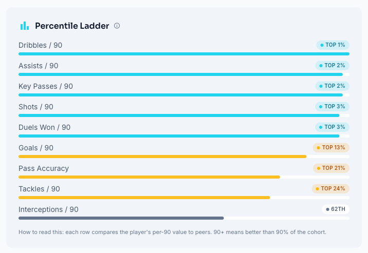
There are two different comparisons here. Season KPI pills, the Percentile Ladder and Strengths & Weaknesses use peers in the same broad position group and selected season/competition scope. The player and peers need at least 450 minutes, and at least ten peers must qualify. Career mode aggregates career records and does not provide that season percentile cohort. The separate Player profile retains its rolling two-year window in either mode.
How to read a percentile. A Top 2% badge places that statistic near the top 2% of the eligible group; a 45th-percentile badge is roughly ahead of 45% of peers. The filtered-stat colour tiers are Elite (95+), Top (90+), Above (66+), Avg (33+) and Below. These are ranks for recorded statistics, not a verdict on the player’s overall ability.
The main sections answer different questions:
- Rating Trend shows rated matches within the selected season and competition scope, with a five-match moving average and a 7.0 reference line. That five-match trend is different from Summary’s ten-appearance Recent Form window.
- Player profile repeats the rolling 24-month comparison explained above. Changing the season or competition does not redraw it for that selection. Always read its own date range and peer count.
- Percentile Ladder ranks the available metrics in the selected season scope, strongest percentile first. Its numbers can differ from the rolling Player profile because the time window, minimum minutes and peer group differ.
- Strengths & Weaknesses picks the highest and lowest ranked measured statistics in that filtered season cohort. A low tackle percentile for an attacker can reflect his job; it is not, by itself, proof of a weakness.
Squad importance also appears here in season mode. It remains a current-club measure with its own match window; selecting an old season does not turn it into the importance score from that season.
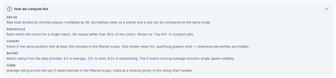
The category tables break the output into areas such as Shooting, Passing, Defending, Dribbling and Duels; goalkeepers get relevant categories such as Shot Stopping. The How we compute this panel explains the filtered statistics. Player profile and Squad importance have their own information controls and scope notes, so use the explanation attached to the number you are reading.
The other three tabs, quickly
- Matches follows the selected season, with competition, team and starter/substitute filters and per-match detail. Read the scope beside its totals; friendlies can appear in the match list but are excluded from official totals.
- Career groups the recorded appearances by season, club and competition, with totals. It is useful for spotting a loan spell or a change in playing time without confusing different shirts or competitions.
- Transfers — the career-spanning move history, with loan and free-transfer badges.
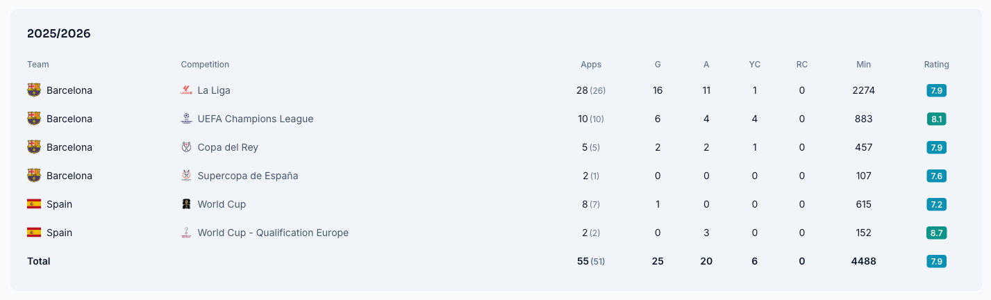
Bio & Quick Answers summarises available current facts and answers questions about the player, including value history where available. These answers do not follow a historical season selection. Read the period named in each answer: a last-five-games answer is a different sample from the ten appearances in Recent Form.
When something is missing
A missing number is not zero. Read the panel’s message and coverage before interpreting a blank:
- No estimated value? The player may lack suitable data or model coverage, the estimate may be withheld by a display rule, or the value may not have loaded. Absence is not a valuation of zero or a judgement that the player has no potential.
- No percentiles? Season comparisons require the player to reach 450 minutes as well as a sufficiently large peer group; Career mode deliberately has no season percentile ladder. The rolling Player profile instead needs 1,800 covered minutes and at least ten peers for each statistic. Missing position or metric coverage can prevent a complete radar even when some figures remain available in Full comparison.
- No rumour pill? There may be no eligible story attached, the transfer-window condition may not be met, or the feature may not have loaded. Check the available evidence rather than treating silence as a transfer report.
- A sparse season or an unavailable panel? An older season may offer a bigger sample for season statistics; it will not change the rolling Player profile. If a card shows a loading error, use Retry where offered. A delayed profile refresh can retain the last successful data with a dated update message. Provisional or Unrated importance labels signal limited evidence rather than a score of zero.
Browsing the whole database
Player values is the wider view: a ranked table of eligible estimates in the covered leagues. Search by player or club, filter by competition or position, and use U21 only for players aged 21 or younger. The table is live; a dated article preserves its own snapshot.
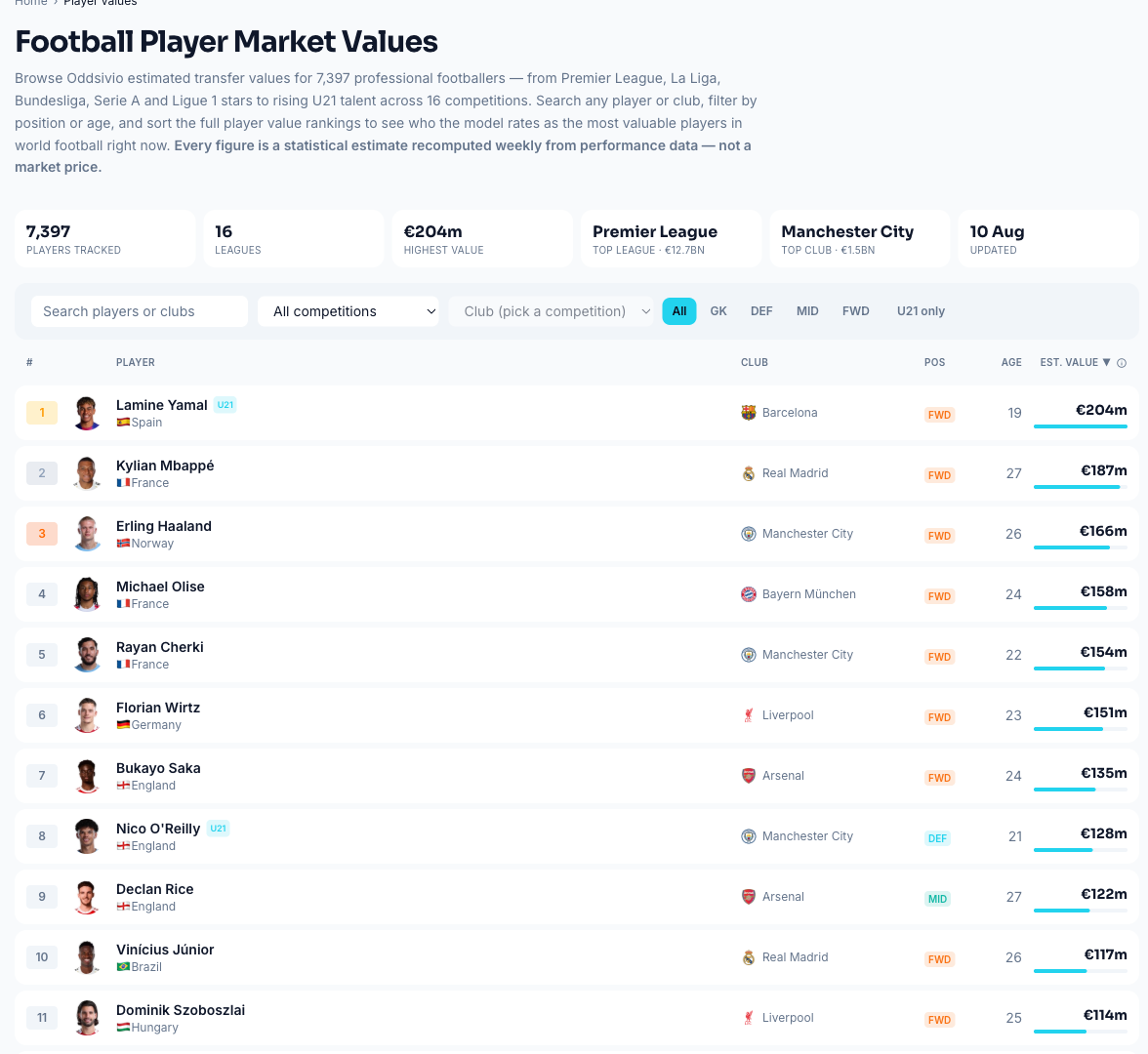
The same page carries the plain-language explainer of how those values are computed, and our full write-up of the model goes deeper still.
Try it on a player you know
Open a player you have watched recently. Read the Player profile’s dates and peer count, then open Full comparison to see the rates behind its shape. Check Preferred Positions and Squad importance for role and club context. For a particular campaign, choose a season and compare the Stats totals and ladder within that scope. A disagreement with your impression is a useful question to investigate, not a reason to treat the chart as a scouting verdict.
See those ideas applied to ten different players in our most valuable U21 players, explained.
If a number surprises you, start with its unit, date range and information control. The Stats glossary explains the filtered tables; the rolling profile and importance panels explain their own rules.